A Guide to the Yamazumi Chart
Learn about Yamazumi charts, how they work, and the different components of these charts.

Learn about Yamazumi charts, how they work, and the different components of these charts.
Published 28 Apr 2026
Article by
5 min read
The word Yamazumi means “to stack up,” and a Yamazumi chart is a stacked bar graph detailing the time it takes to accomplish specific tasks, providing a clear and easy way to visualize work processes. A Yamazumi chart assesses cycle times or how long it takes employees and machinery to finish different tasks.
The benefit of these charts is that managers visualize the workplace’s performance and efficiency. It also gives a clear assessment of what tasks take up too much time and where variations or waste stem from.
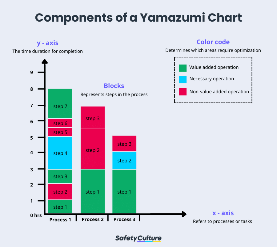
A Yamazumi is a bar graph consisting of an X and Y-axis. In the example below, each block represents a step in the process. The Y-axis shows the time it took to complete specific tasks or processes, while the X-axis represents different operators and workstations.
A Yamazumi chart should include process optimization and lean management metrics to
display and analyze the cycle times of tasks within a process. It is presented as a stacked bar chart, with these components included:
Axes:
Y-axis: Represents the cycle time of tasks.
X-axis: Represents different process steps, workstations, or operators.
Task Categories:
Tasks are categorized into:
V alue-Added (VA): Activities that directly contribute to the product or service.
Non-Value-Added (NVA): Activities that do not add value but are necessary.
Waste (Muda): Activities that add no value and should be eliminated.
Stacked Bars:
Each bar represents a process step or workstation.
Blocks within the bar represent individual tasks, stacked to show their cumulative time.
Color Coding:
Different colors are often used to differentiate task categories (e.g., VA, NVA, Waste) or operators for easy interpretation.
Target Cycle Time:
A line representing the target cycle time (e.g., takt time) is often included to identify imbalances and areas for improvement
Yamazumi Chart | SafetyCulture
Yamazumi charts are color-coded to make it easier to interpret the graph and dissect the data. The chart allows you to view which areas of the process or what workstations require optimizations, making it much easier to meet goals.
A company’s main goal should always be increasing productivity and efficiency. This can make everyone’s job easier and increase the output of every area of operation. And the first step in increasing productivity is understanding what steps in the process take up the most time.
When you have an estimate of the optimal time it should take to finish a task and compare it with the actual time it takes to accomplish them in the workplace, it makes it easier to find the areas of improvement. This is the specific purpose of a Yamazumi chart and the reason why companies in different industries are utilizing it.
Generally, Yamazumi charts are used for time optimization and line balancing. With the chart, you get to directly compare the time it takes different operators to accomplish tasks, point out areas for optimization, and make small adjustments to help meet your goals.
The Yamazumi chart traces its roots back to Japan. The word literally means “to stack up.” It refers to how the graph stacks different tasks on top of each other for easy visualization of the entire process. Originally, these charts were used by car manufacturers in Japan, such as Toyota, who utilized these charts for line balancing and overall optimization.
However, while the chart originates in the manufacturing industry, it can be applied in many different ways. This chart works best for calculating and comparing machine time cycles, but you can also switch up the blocks with other workplace tasks and bring workplace optimization to the next level.
One of the reasons Yamazumi charts are widely used in many industries is their simplicity. It doesn’t take too much practice and technical know-how to interpret a Yamazumi chart, which is why its applications aren’t just limited to manufacturing.
To start, a Yamazumi only contains an X and Y-axis. So, once you understand what each of the axes represents, understanding the message of the graph becomes much easier. The Y-axis shows the cycle time or time it takes to accomplish the task, while the X-axis shows the different tasks at hand and the operators in charge.
For example, one column in the graph could represent operator A while the other represents operator B performing the same process. You can plot each step in the process in the respective columns and stack them on top of each other. And by the end, you will clearly see what areas each operator performed better or worse.
You can plot a target cycle time for even more comprehensive data for each task. This gives you another reference point to determine how effective a specific operator is and how you can optimize the entire process.
Yamazumi can help eliminate wasted time, or “mura” as it’s called in Japanese, by giving managers a clear idea of how well different teams perform for certain tasks.
Empower your team with SafetyCulture to perform checks, train staff, report issues, and automate tasks with our digital platform.
SafetyCulture is a mobile-first operations platform adopted across industries such as manufacturing, mining, construction, retail, and hospitality. It’s designed to equip leaders and working teams with the knowledge and tools to do their best work—to the safest and highest standard.
Streamline processes, eliminate bottlenecks, enhance resource utilization, and build an agile and scalable infrastructure with SafetyCulture. Strive for operational excellence to boost competitive advantage, foster sustainable growth, and deliver long-term value.
✓ Save time and reduce costs ✓ Stay on top of risks and incidents ✓ Boost productivity and efficiency ✓ Enhance communication and collaboration ✓ Discover improvement opportunities ✓ Make data-driven business decisions